WEBSITE REDESIGN
WEBSITE REDESIGN
WEBSITE REDESIGN

I helped redesign a local business’ website that was outdated and confusing to use, to a more fresh and organized website in the hopes to help their business

I helped redesign a local business’ website that was outdated and confusing to use, to a more fresh and organized website in the hopes to help their business

I helped redesign a local business’ website that was outdated and confusing to use, to a more fresh and organized website in the hopes to help their business

Project Overview

Project Overview

This project was focused on completing a redesign of a local business’ website. I chose a local pizza shop in San Francisco, Golden Boy. It's a popular restaurant but the subject of my redesign with the aim of making their website more modern and aligned with their vibe with the goal of helping the business continue to grow and thrive.

This project was focused on completing a redesign of a local business’ website. I chose a local pizza shop in San Francisco, Golden Boy. It's a popular restaurant but the subject of my redesign with the aim of making their website more modern and aligned with their vibe with the goal of helping the business continue to grow and thrive.

👩‍💻 My Role: Solo UX/UI Designer

👩‍💻 My Role: Solo UX/UI Designer

🧰 My Toolbox:

🧰 My Toolbox:

My Responsibilities:

My Responsibilities:

  • User Research & Competitive Analysis

  • Design Strategy

  • User Flows & Task Flows

  • Visual Design

  • Wireframing

  • Prototyping & Usability Testing

  • User Research & Competitive Analysis

  • Design Strategy

  • User Flows & Task Flows

  • Visual Design

  • Wireframing

  • Prototyping & Usability Testing

My Process

My Process

My Process

Test, Discover & Define

Test, Discover & Define

I conducted user surveys and task-based testing to identify pain points with the existing Golden Boy site, revealing issues with navigation, clarity, and outdated design. These insights helped define a clear problem statement and user-centered goals for the redesign.

I conducted user surveys and task-based testing to identify pain points with the existing Golden Boy site, revealing issues with navigation, clarity, and outdated design. These insights helped define a clear problem statement and user-centered goals for the redesign.

I conducted user surveys and task-based testing to identify pain points with the existing Golden Boy site, revealing issues with navigation, clarity, and outdated design. These insights helped define a clear problem statement and user-centered goals for the redesign.

Ideate & Design

Ideate & Design

Based. on my research, I created a streamlined sitemap and low-fidelity wireframes focused on intuitive navigation and simplified page structure, ensuring easy access to key information. The design emphasized clarity and consistency across desktop and mobile.

Based. on my research, I created a streamlined sitemap and low-fidelity wireframes focused on intuitive navigation and simplified page structure, ensuring easy access to key information. The design emphasized clarity and consistency across desktop and mobile.

Based. on my research, I created a streamlined sitemap and low-fidelity wireframes focused on intuitive navigation and simplified page structure, ensuring easy access to key information. The design emphasized clarity and consistency across desktop and mobile.

Test & Deliver

Test & Deliver

I tested the high-fidelity prototype with users, gathered feedback, and iterated to refine the design. The final product was a clean, user-friendly website aligned with both user needs and business objectives.

I tested the high-fidelity prototype with users, gathered feedback, and iterated to refine the design. The final product was a clean, user-friendly website aligned with both user needs and business objectives.

I tested the high-fidelity prototype with users, gathered feedback, and iterated to refine the design. The final product was a clean, user-friendly website aligned with both user needs and business objectives.

Test, Discover, & Define

Test, Discover, & Define

Competitive Analysis

As part of the redesign process for Golden Boy Pizza’s website, I conducted a competitive analysis comparing both direct and indirect local pizza shop websites. I evaluated key business and website features such as sit-down options, delivery, site navigation, brand clarity, and overall usability. This analysis helped highlight where Golden Boy’s current site was falling short—particularly in navigation, calls to action, and visual clarity—compared to competitors with more modern, accessible, and user-friendly designs. These insights directly informed design priorities to improve user experience and better reflect the brand’s unique identity.

Click to enlarge

Click to enlarge

User Surveys

Surveys were conducted with 9 individuals where they were asked to interact with Golden Boy’s current website (goldenboypizza.com) through a series of tasks and provide their feedback by scoring how easy or difficult each task was. Additionally, those surveyed provided qualitative feedback on their experience with the navigation, organization, design etc. of the website.

Some tasks and questions included:

  • Navigate to the menu for the restaurant

  • Navigate to the hours and address of the North Beach location

  • Imagine you want to order from Golden Boy, how useful is the website in providing this information?

  • How do you feel about the design (look and feel) of the website?

  • How easy or difficult was it to navigate the website?

Key Takeaways

Click to enlarge

Click to enlarge

Full research synthesis can be viewed in FigJam: Affinity Map

The Problem

This project’s initial assumption is that consumers who are wanting to support local and sustainable food sources have difficulty discovering and navigating all the options available to them.

Through research I discovered this was true, it’s overwhelming for users to learn of local food sources, markets, restaurants, etc. as well as planning their grocery trips focusing on local sources. There’s a gap in the market for a centralized solution to discover local food sources combined with a planning tool to keep users organized as they shop local.

The Goal

Understand why users decide to shop local & sustainable food products, what their desires are and what their pain points are.

Define the problem and user story through synthesis of user research findings and hone in on a proposed mobile app solution.

Build and test an app design to improve the experience of users trying to shop local and support their community.

User Persona

To build this user persona for the Golden Boy website redesign, I synthesized insights from my research and surveys to represent a key segment of the target audience: tech-savvy, urban food lovers. "Adam Watson" captures the mindset of a typical user who enjoys discovering new restaurants but values efficiency, clear information, and a modern online experience. His goals and frustrations helped guide design decisions that prioritized intuitive navigation, up-to-date content, and ease of ordering. This persona served as a reference point throughout the project to ensure the redesign stayed aligned with real user needs and behaviors.

Click to enlarge

Click to enlarge

Ideate & Design

Ideate & Design

In order to improve the user experience of the Golden Boy website I plan to update the overall look and feel to be more modern and bright, as well as adding more organization of information with pages that can easily be accessed via navigation. This will make the website more useful to users who want to learn more about Golden Boy and make it easier to support their business with the added feature of ordering.

Sitemap

I created a sitemap to organize the basic structure of the website starting with Home Page with clear navigation to the main pages: Menu, Locations, About and Order. This was lacking in the original website and navigation was the main pain point in our surveys on the usability of the old website.

Click to enlarge

Click to enlarge

Wireframing

After defining the sitemap, I moved into creating low-fidelity wireframes to establish a clear, user-friendly structure for the Golden Boy website. My goal was to simplify what had been a disorganized and confusing site by introducing consistent navigation across all pages. Each core section—Home, Menu, Order/Catering, Locations, and About—was designed with a persistent header and clear visual hierarchy, ensuring users could easily orient themselves and find what they need. I designed both desktop and mobile wireframes to ensure responsiveness and accessibility across devices.

After defining the sitemap, I moved into creating low-fidelity wireframes to establish a clear, user-friendly structure for the Golden Boy website. My goal was to simplify what had been a disorganized and confusing site by introducing consistent navigation across all pages. Each core section—Home, Menu, Order/Catering, Locations, and About—was designed with a persistent header and clear visual hierarchy, ensuring users could easily orient themselves and find what they need. I designed both desktop and mobile wireframes to ensure responsiveness and accessibility across devices.

Click to enlarge

Click to enlarge

HiFi

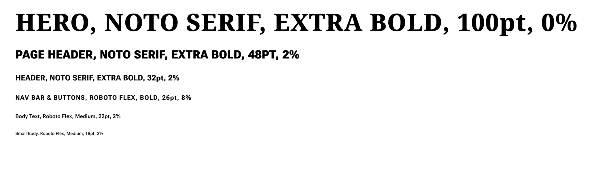
Once the layout and content structure were solidified, I transitioned to high-fidelity prototyping, focusing on visual design, branding, and usability. I chose a bright, energetic color palette of reds and yellows inspired by the restaurant’s signage and atmosphere to reflect Golden Boy’s bold personality. I vectorized the iconic sign to use as a logo, selected bold, legible fonts (Noto Serif and Roboto Flex), and gave UI elements a more rounded, approachable look. My design system ensured consistency across typography, buttons, and components.

Finally, I brought everything together in an interactive prototype that reflects the full user experience—from browsing the menu to finding a location or placing an order. The result is a modern, cohesive website that captures the essence of Golden Boy while improving functionality and accessibility for users.
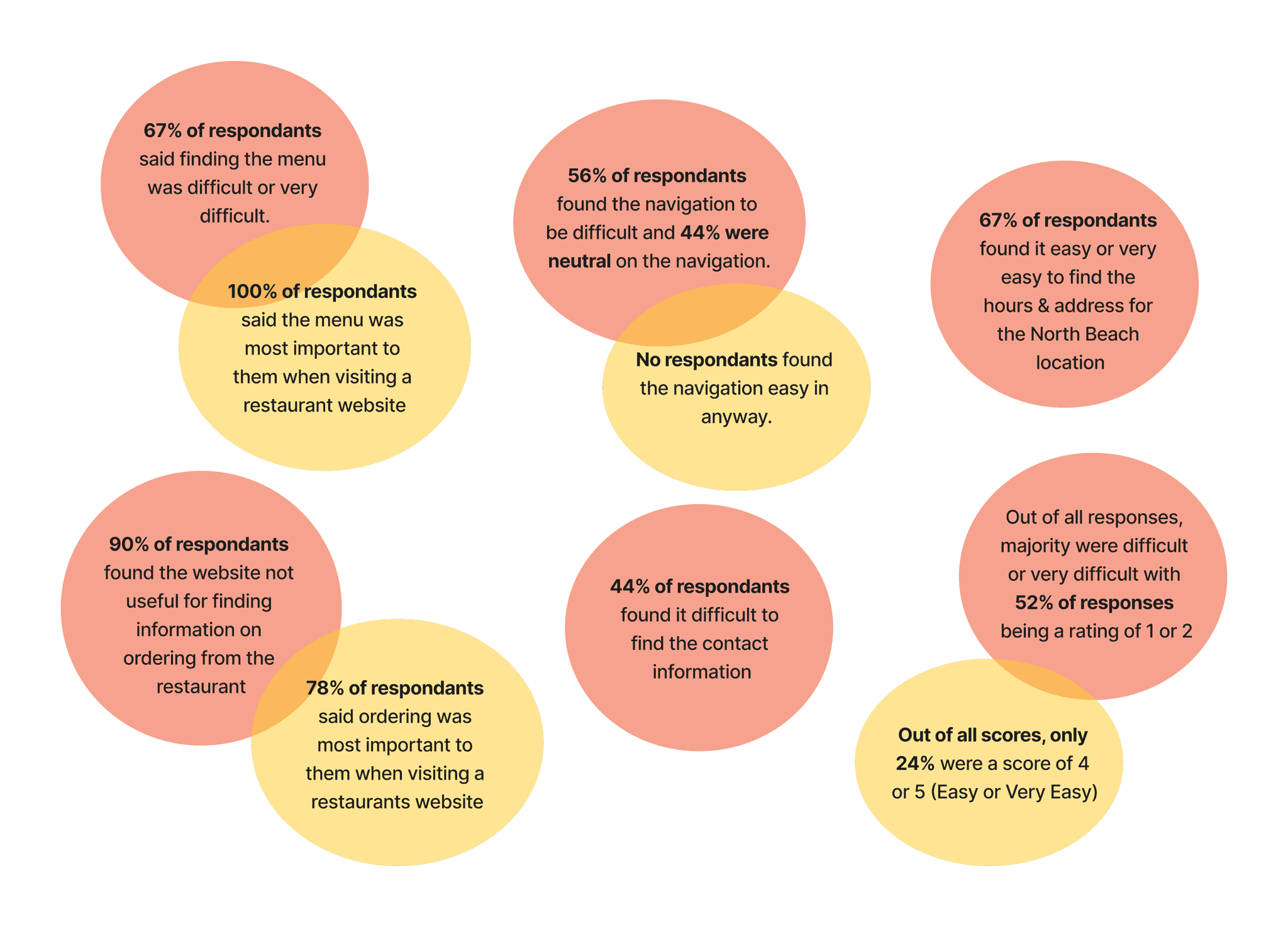
Test & Deliver

Test & Deliver

Usability Testing

I built an interactive prototype in Figma and performed a mix of moderated/unmoderated tests with 8 participants. I asked participants to freely use the prototype and then fill out a catering request and find contact info for one of the restaurants.

Most of the feedback was positive as users liked the improvement of the design and the organization of the website. Some areas they had feedback on were around the location of the catering form (at the bottom of the Ordering page) and the outlines of the photos being too dark.

Click to enlarge

Click to enlarge

Priority Revisions

Based on the feedback above, I attempted to revise the prototype. I added the catering form to the homepage while also keeping the original location on the Ordering page.

Click to enlarge

Click to enlarge

I tried out different colors for outlines and I feel it threw off the design as the black was helping give a more retro feel. Given that feedback only came from one person, I decided to keep the black as is but lightened the stroke a little bit.

Learnings

This was my first project working with a real client, although offering my services for free. This came with challenges of trying to coordinate with a busy client as well as trying to explain the design process and principles to a client who is unfamiliar to them. I found value in breaking down the process into small pieces and providing the client a detailed timeline of what to expect helped them feel more comfortable going into the project.

It was also difficult at times getting ahold of my client so there were times where I couldn’t get their feedback on the designs. I learned that with this particular client providing them 1-3 options to pick from was the easiest way to get their input. I also had to learn to make decisions on my own with my client’s interest in mind, which I feel I was able to do more easily near the end of the project.

I was familiar with Golden Boy from living in San Francisco so I felt a familiarity with the restaurant, the brand, and its reputation and history in the community. It was exciting to try and help them with their website redesign and I hope to see them implement the designs in the near future when they have the bandwidth.

Next Projects:

Next Projects:

Next Projects:

© Framer Inc. 2023

© Framer Inc. 2023

© Framer Inc. 2023